[Interview] How Samsung OLED TV Achieved Pantone® Validated ArtfulColor Certification
Great art invites a closer look, where texture, tone and colour all contribute to its depth and character. Preserving those qualities on a TV screen takes balance, subtlety and precision.
S99H, the latest flagship OLED TV, recently earned Pantone Validated ArtfulColor certification, a designation awarded to TVs, displays, cameras and printers that reproduce colour with a high degree of fidelity under controlled lighting conditions. That means stunningly precise colours when watching content and a realistic, museum-like experience when displaying art.
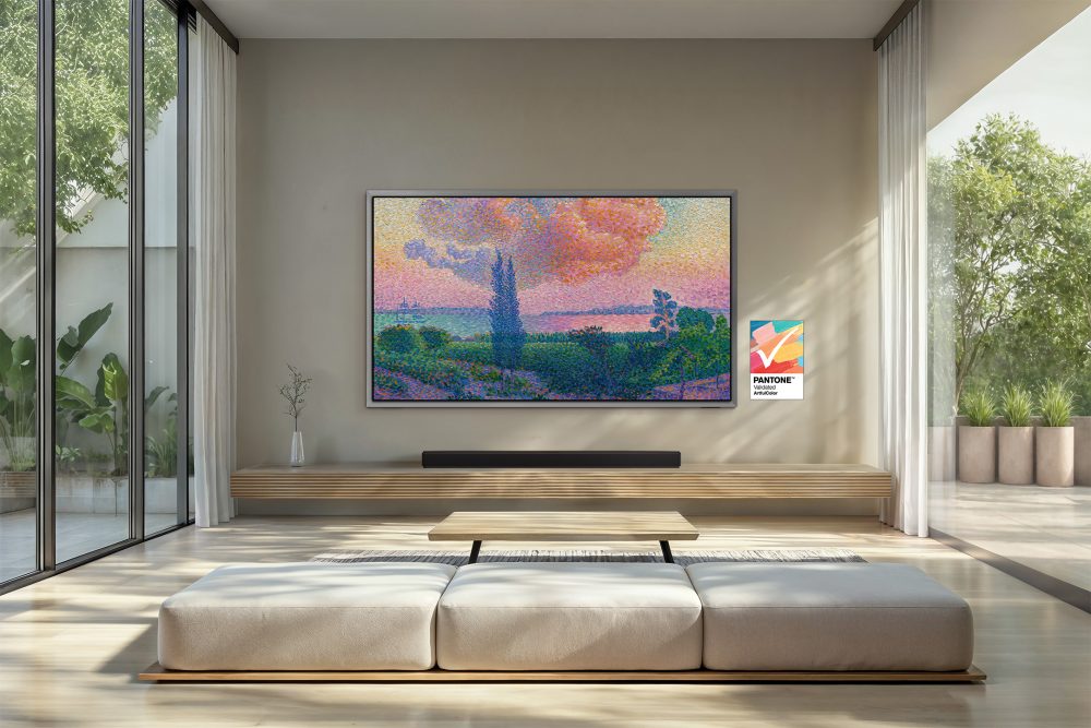
▲ 2026 OLED TV S99H has earned Pantone Validated ArtfulColor certification for faithful colour reproduction. S99H displays The Pink Cloud by Henri Edmond Cross.
The certification is a particularly significant milestone for Samsung OLED, as S99H is engineered to deliver deep contrast, precise color expression, and an unparalleled, distraction-free viewing experience. The TV’s deeper blacks and Glare Free technology[1] help preserve textures and tonal variation, making art feel more immersive on screen.
To learn more about what this means for the art-viewing experience, Samsung Newsroom spoke with Ed Hattenberger, OEM Senior Colour Scientist, and Matt Knoll, OEM Technical Director, at X-Rite Pantone. They share how Pantone Validated ArtfulColor is evaluated, why colour fidelity matters for viewing art, and how display performance can shape the way artwork is experienced at home.
Q. Could you tell us a bit about your role at Pantone and the work you do?
Hattenberger: As an OEM Senior Colour Scientist at X-Rite Pantone, I’ve spent more than 15 years specialising in Pantone colour development standards and in bringing real-world colours into the digital realm. I also led the innovation of various digital colour products at Pantone, including the Pantone Validated program.
Knoll: I’m an OEM Technical Director for X-Rite Pantone. I have more than 20 years of experience in hardware and firmware development at X-Rite, with much of my work focused on reflective colour measurement and display calibration products.

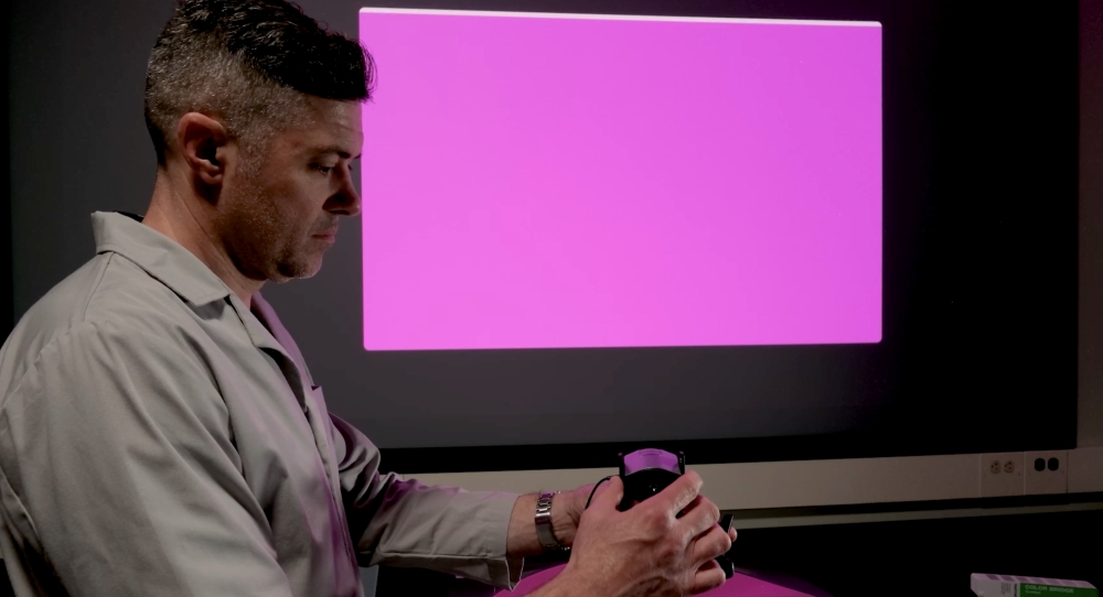
▲ Pantone evaluates display performance under controlled lighting conditions as part of the Pantone Validated ArtfulColor process.
What Art Can Reveal About a Display
Q. What does Pantone Validated ArtfulColor evaluate and what does the validation mean for a display?
Hattenberger: Pantone Validated ArtfulColor evaluates the ability of displays to faithfully render on-screen colours to match an extensive range of physical Pantone Colours and Skin Tones under controlled lighting conditions. For displays, Pantone Validation means that a product’s colour reproduction has been measured against Pantone’s reference colour data and meets defined performance thresholds for colour fidelity and consistency.
Knoll: Displays that earn ArtfulColor status reproduce the test colours with a high degree of visual accuracy, resulting in a close perceptual match between the on‑screen image and the physical colour sample.
▲ Pantone ArtfulColor certification tests and confirms that the display can reliably reproduce real-world Pantone colours under controlled lighting conditions, similar to actual exhibition environments..
Q. What differences can viewers actually see when viewing a Pantone Validated ArtfulColor TV versus one that is not?
Hattenberger: A Pantone Validated ArtfulColor TV delivers more precise, trustworthy visuals, especially for artwork and photography. Viewers can expect cleaner neutrals, more lifelike skin tones and colour saturation that better reflect the artist’s intent. These displays also preserve shadow detail, so every brushstroke and color appear more natural and consistent.
Q. Why does colour fidelity matter more when a TV is used to display art and photography?
Knoll: In creative work, colour is never incidental. Colour, balance and slight variation all shape how a piece is experienced. That is why colour fidelity matters so much. Even slight shifts can alter the mood, depth and overall intent of the original work.
▲ Pantone’s validation process measures how faithfully a display reproduces colour under standardised viewing conditions.
The Science Behind Colour Fidelity
Q. How does the ArtfulColor validation process work from start to finish?
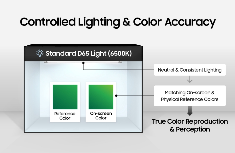
Hattenberger: The process evaluates a display’s ability to match Pantone Colours under controlled lighting conditions. This involves measuring a set of Pantone colours and skin tones in a light booth, then assessing how faithfully the display reproduces them on screen under those same conditions.
Q. Why does controlled lighting matter when evaluating a display for art?
Knoll: Reproducing true real-world colours on screen depends on matching the light source, colour sample and rendered content for the intended observer. Displays are typically measured against D65, an industry-standard white point that approximates neutral daylight, so it gives Pantone a consistent point of reference.
It also helps reduce the influence of warmer or cooler room lighting, which can change how white, contrast and colour are perceived. Using controlled lighting helps ensure the display is evaluated as accurately and consistently as possible.
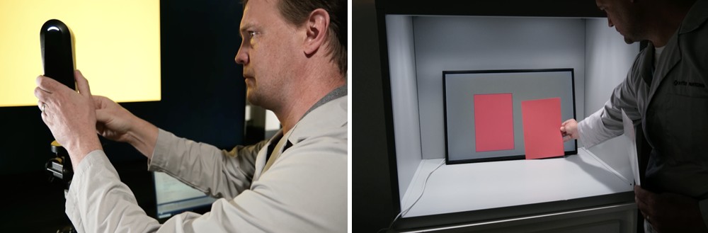
▲ By comparing digital images with physical colour references, Pantone helps verify faithful colour reproduction across a range of hues.
Q. How does Pantone make sure the results apply to real artwork and photography, not just lab test patterns?
Hattenberger: Pantone goes beyond digital test patterns by using physical colour samples that behave more like real artistic media. That helps verify whether a display can accurately reproduce gradients, subtle tonal transitions, textures and near-neutral tones across artwork and other visually complex content.
At the same time, the home viewing environment can influence how colour is perceived compared with a controlled test setting. Ambient light, reflections, viewing angle and even wall colours can all affect perception, so while validation confirms the display’s underlying performance, the room still plays an important role in what people see.
How Samsung OLED S99H Helps Art Look Its Best at Home
Q. From Pantone’s perspective, what makes Samsung OLED S99H well-suited to display art with high colour fidelity?
Knoll: OLED is particularly well-suited to high-fidelity art reproduction because its pixel-level luminance control delivers true blacks and very high contrast, preserving fine detail critical to art. S99H’s wide colour gamut supports accurate reproduction of saturated pigments, paints and digital art colours, while stable viewing angles help colour and luminance remain consistent across the screen.
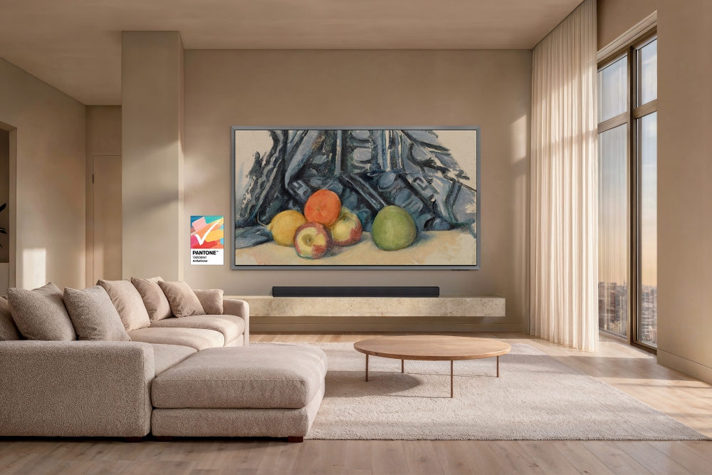
▲ S99H displays Apples and Cloth by Paul Cézanne.
Q. Samsung OLED S99H features award-winning Glare Free technology that eliminates distracting reflections. How do glare and reflections affect the way art is seen on screen?
Hattenberger: Glare and reflections can interfere with the way art is seen on screen. They lift black levels and soften contrast, which can reduce depth and colour fidelity, especially in darker parts of an image. They can also introduce colour casts from the surrounding environment, affecting neutrals and shifting hues.
When people view art, they expect a clear, unobstructed image. Reducing reflections helps preserve tonal accuracy and the integrity of the work.
Q. How has Pantone’s validation approach evolved alongside newer display technologies like OLED, HDR, and wide colour gamut?
Knoll: Pantone’s evaluation approach has evolved with display technology itself. With OLED, that includes evaluating pixel-level luminance control, deeper contrast, wider colour reproduction and consistency from bright highlights to near-black areas.
Q. When viewers see the Pantone Validated ArtfulColor mark on a Samsung TV, what does it say about the viewing experience?
Hattenberger: The ArtfulColor mark signifies that S99H has been carefully evaluated to confirm a high level of colour fidelity, including consistent hue rendering, stable grayscale performance, and repeatable colour behavior under controlled lighting conditions.
Ultimately, it gives viewers greater confidence that the art they see on screen is being presented faithfully to the original work.
S99H newly joins The Frame Pro and The Frame in receiving the certification, as Samsung remains the only TV brand to offer Pantone Validation ArtfulColor and continues to expand Samsung Art Store[2] across more screens.
S99H features the new FloatLayer Design, with a slim metal bezel that mounts flush to the wall for a floating effect. This gallery-inspired look makes the display a striking centerpiece, particularly when displaying art.
For the first time on a Samsung OLED TV[3], Samsung Art Store subscribers can access over 5,000 works by more than 800 artists, including exclusive collections from MoMA, Musée d’Orsay, Art Basel, and others.
[1] Measured against Unified Glare Rating (UGR) testing standard, validated as ‘Glare Free’ by UL.
[2] Art Store subscription and Samsung Account connection required to access full selection of artwork.
[3] S99H only.
Products > TVs & Displays
For any issues related to customer service, please go to samsung.com/uk/support for assistance.
For media inquiries, please contact seuk.pr@samsung.com.