[Design Story] Front Stage and Behind-the-Scenes
on September 10, 2015
Often we’re more interested with what goes on behind the stage than on the stage itself. Indeed, a well-prepared production is a feast for the senses, but more often than not, the backstory or the making of an event equally piques our interests.
Market leaders in the smart technology sector also have their own subplots, the unrevealed stories behind what they make. The form and functions of a device, the trial and error journey to the finished product, those stories strike our curiosity and cause us to fall in love with the product all the more.
At last, the Galaxy Note5 and the Galaxy S6 edge+ are here. For now, many are still digesting the initial specifications and innovations of the much anticipated devices. But once this period of preliminary intrigue has subsided, more specific inquiries arise. The early adopters start to become accustomed to their devices but what experiences do they have? What stories can they tell? With new galaxies of possibilities now at our fingertips, we sat down with the designers of the Galaxy Note5 and the Galaxy S6 edge+ to hear their first-hand experiences.
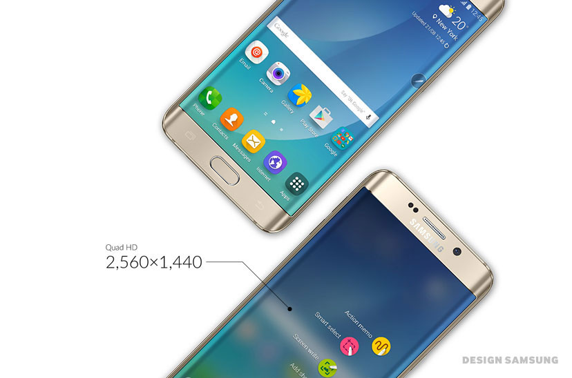
Q: Thank you for meeting us. First, could you give us a brief overview of the new Galaxy Note5 and the Galaxy S6 edge+; how they were developed and how that progressed? The biggest change I see is the size. They have a 5.7-inch display screen with a bezel that is noticeably thinner.
A: Tablet-size devices (smart devices with 5-inch or larger screens) are a global trend. To appeal to this need, as well as adhere to the unique visual language of the entire Galaxy line was of utmost importance to us. Our visual theme for 2015 is a future-forward minimalist look and feel based on perfecting the relationship between design and technology, in short Minimal Futurism. Having said that, it was equally important to have each device stand out on its own, in line with this design approach. Both products retain a strong fluid contour from the curved glass to the body, and as you mentioned, we streamlined the device for a sleeker, more compact feel.
Q: Although the screen size is the same, both of these devices have their own unique feel. Could you tell us more about these two products?
A: The approach for both devices was to maintain the overall visual language, but to build on that foundation. The wider curved glass of the Galaxy S6 edge+ allows a more immersive, digital interactive experience. For those who use their devices for entertainment or multi-media will quickly warm to this new feature. The Galaxy Note5 however, takes on a more formal look. The curvature of the display continues on to the reverse side for a better grip, while the S-Pen is now metal to complement the device itself. Also, as soon as you pop out the S-Pen, you’ll immediately see it’s been totally re-designed to assist you in all your creative activities.
Q: The bezel on both devices are noticeably thinner, almost as if the frame has disappeared.
A: A thinner device is fast becoming the norm. The Galaxy S6 edge+ especially has curved glass that seemingly overlaps its surroundings. The original form is the same as the Galaxy S6, but now it has a slightly thinner top and bottom finish to make it look even slimmer than it already is.
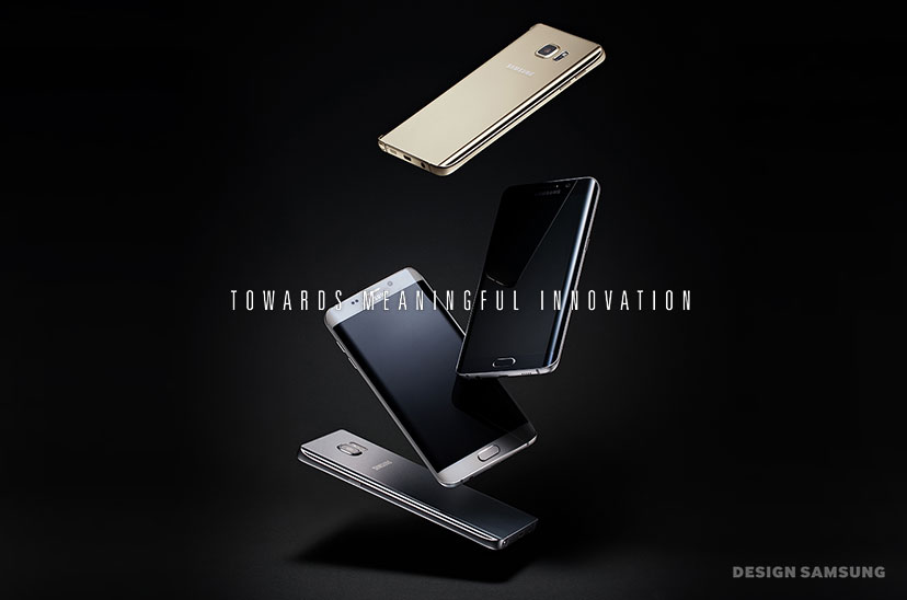
Q: Black Sapphire, White Pearl, Gold Platinum, and now Silver Titanium have been added to the range of available colors. After actually seeing them, the colors are much deeper and richer than originally anticipated.
A: Yes, we’re excited about the range of colors with this lineup. Like the previous colors, this selection also has slight variations in hue and saturation according to how the light hits it. Giving it this richer look will appeal to urban city dwellers constantly interacting with their devices.
Q: The metal and glass combination was quite natural. It’s nice to see that look has been carried over to these new models as well.
A: When you handle the device, you feel the density of the lines and curves that join the glass and metal into a seamless whole. The device itself feels well-constructed and well-crafted. That’s the feeling we wanted to convey, a reliable device, exquisitely designed.
Q: Beyond the exterior, what other things should we know about the newest models?
A: There have been big and small changes to the user experience. Detailed changes have been made to elements of the screen. This is because the increased size meant that things needed to be organized and spaced differently. We’ve also adjusted the keyboards and loading bars, among other things. As minute as this may sound, we underwent many revisions on a millimeter scale moving elements around ever so slightly so that they are positioned perfectly for users. We’re confident that although you may not notice these changes at first, once you start getting accustomed to the new model, you’ll notice the difference.
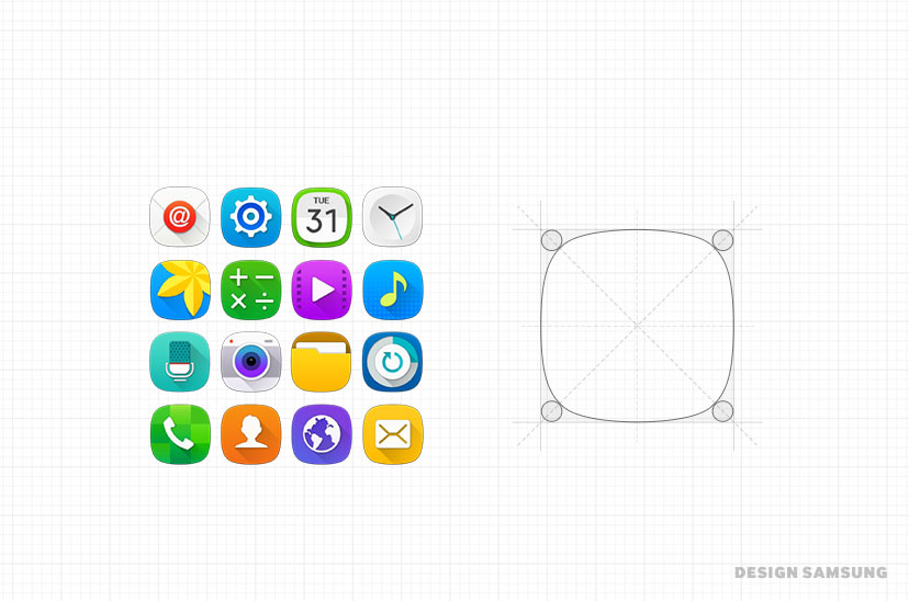
Q: The biggest changes I can see are the icons. The icons seem to all have a shape that is between a circle and a square. Is there a reason for that?
A: Yes, we call them squarcles! Obviously a word combining circle and square, this unique shape for the container of each icon is unique to Samsung devices and maximizes the touch zone without increasing in size. It’s an intuitive yet innovative way to convey consistency in our user design.
Q: This was introduced at the launch of the new models, the S-Pen has a new innovation. You can use it to write down things even though the screen is off.
A: That’s the screen off memo feature, without turning on the screen you can use the S-Pen to write down quick ideas or thoughts. For this, we needed a smooth interactive function that would notify the user that the screen off memo feature was activated when detracting the pen from the holder. That’s because frankly, it’s not common to write or sketch on a blank dark screen without any indication of what you’re doing. A tiny ink “plop” will appear when you detach the pen signifying that the function has been activated, while other basic function icons will appear, only muted. Once you’ve finished and have saved the memo, the writing itself will shrink away leaving you with a blank screen.
Q: As cute as that seems, it’s an ingenious way of solving a difficult issue with visual interaction.
A: To get to this small interaction took us numerous other ideas and actions. This is a prime example of all the many visual interactions and well as iterations we went through to get to the device you hold in your hands.
Q: I’m curious to know how you maintained consistency among all those different kinds of visual interactions.
Like the screen off memo function, the overall concept was for the interactions to be fluid. Another example of this is the change in the Air Command interface; from a geometric, almost rigid feel to a rippling effect as the various icons plop out onto the screen.
With the Galaxy S6 edge+ visual interaction, you can share content and musings with close friends. The camera and emoticons in particular have a fluid responsiveness. Inertia, elasticity and flow are all natural movements we see that should look and feel natural when emulated on the screen. The actions themselves are calculated mathematically and applied to complex physics models, but for the users it’s a natural reaction that is accepted immediately.
Q: Anticipation is growing with each new launch of the Galaxy series. I guess you could say that excitement stems from the globally recognized quality of the devices and innovations. Now, with the Galaxy Note5 and the Galaxy S6 edge+ newly released, what could we expect next from the Galaxy series?
A: It was mentioned briefly when we were discussing visual interaction, but the design philosophy of Samsung Electronics is meaningful, human-centered design. The curved glass of the Galaxy S6 edge+ delivers a unique and limitless form of entertainment while the S-Pen of the Galaxy Note5 offers a highly specialized, yet creative workflow. All of our innovations start from the experience of our customers, satisfying the values and goals they deem most important. That is, as it’s always been, the direction forward for the Galaxy series of innovations. Ultimately, it’s not how high-tech it is, but how close it is to us and our everyday lives.
Thank you for the interview, we hope to talk again with newer Galaxy innovations and products.
Visit design.samsung.com to read more Samsung Electronics design stories.


