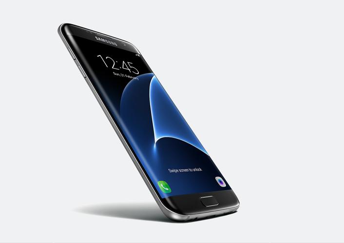
[Design Story] Genuine Premium Quality – Part 1: Unveiling the Galaxy S7 & S7 Edge
on February 29, 2016
A phone that is able to portray both passion and innovation will resonate with consumers in a real way. And so after much effort and persistence, we finally have the Galaxy S7 and Galaxy S7 edge in our hands.
High end technology is encapsulated inside an inviting comfortable design. It’s a perfect marriage seen by paying attention to usability, but also keeping a sharp eye on craftsmanship. We present a new standard based on the unwavering precedent set by the Galaxy S series.

Touch is the New Sight
As a smart device is in your hands pretty much all day, the experience of touch, or interacting with your phone, is equally important as the way it looks. Because of this, many minute easy-to-miss details have been given extra attention to enhance this very experience.
Through 3D Forming glass technology, we’ve combined the curved glass and metal to create a seamless singular smooth yet natural shape. Even the buttons have become thinner and do not disrupt the contour of the device. There’s a much slimmer rear camera that is continuous with the shape and finish of the overall design and a slight sliver has been shaved off the sides to increase the sensation of holding the device in your hands. The transparency of the glass material together with the dimensional curves of the phone give it a volume and depth not seen, or felt, in recent smartphones. Also, a set of calm, serene colors to choose from add an emphasis of sophistication. Of note is Black Onyx, as a subtle spectrum of deep black to grey hues appear according to how the light fractures on the device.
A refined experience
With ‘feel & touch UX’ as our design motto we focused on drawing closer to our users.
The overall color palette of the app icons has been softened, making it easier to view over an extended period of time. Also, much attention was placed on improving the graphical user interface, resulting in a simple, continuous experience. The width of the device as well as its functions have been enhanced with an Always On Display (AOD) function that shows the time, date and simple alerts even when the device is not in use.
Just like the design of the phone itself, the user experience design also has subtle changes that are not noticeable at first but become apparent as you familiarize yourself with the Galaxy S7 series.
Journey to Perfection
The smartphone is now probably the most intimate everyday device. As such, Samsung Electronics always strives to close the gap between user and device, to provide meaning in the experience of interacting with our products no matter how small the detail or subtle the change is.
The journey of the Galaxy S7 Series is just beginning. The drive and commitment of the designers here at Samsung Electronics is the underlying trope to this tale of finding perfection; genuine premium quality and meaningful design continues in our next episode.


