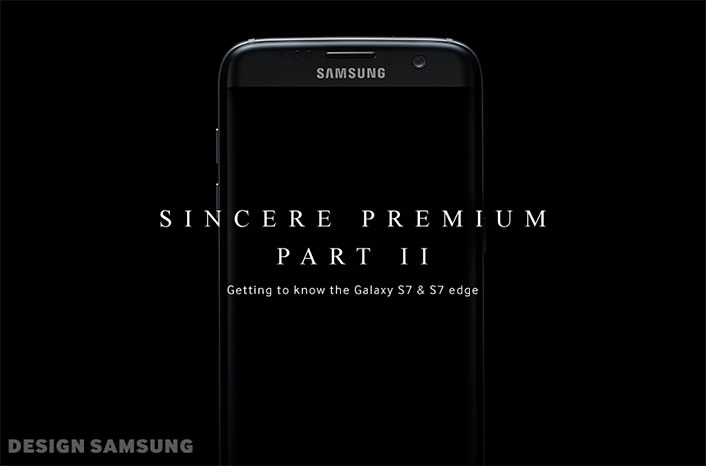
[Design Story] Genuine Premium Quality – Part 2: Unveiling the Galaxy S7 & S7 Edge
on March 11, 2016
Sincere 7, innovate 7
The Galaxy S7 and Galaxy S7 edge are here. The journey to perfection has at last culminated the palm of your hands. The Galaxy S7 and S7 edge design story is an accumulation of the Galaxy series design identity as well as the relentless pursuit of creating a more human-centered device both in form and user experience.
As we mentioned in the previous episode, we’ll go a bit deeper into the design language of the new Galaxy S7 and S7 edge. Think of it as a precursor to the real thing you’ll be holding in your hand soon enough.
Touch is the New Sight: Surprised? Pick it up, you haven’t seen anything yet

Imagine a pebble on the beach polished by the constant crash of waves. It is a work of art, perfected by nature. That pebble smooth and seamless, is in a nutshell, the design approach of the new Galaxy S7 and S7 edge. The design really resonates in the touch rather than the look of the design. Pick it up, it feels better in your hand than it actually looks. We’re confident that you’ll quickly build a rapport with the Galaxy S7 and S7 edge as you keep reading and finding out more about the different functions and features of this new work of art.
A Simpler Design for You, a Highly Complex Approach for Us

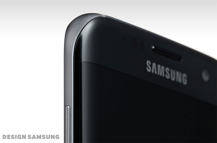
The new Galaxy S7 edge front glass is designed with 3D thermoforming technology. The entire dimensions, including the tempered sides of the phone, were molded into one coherent whole. The tempered glass was slowly shaped in immensely high temperatures, a highly complex technique that is not for the faint of heart. This new form serves to enhance the grip, but also the subtle nuance of light that hit and reflects on the device gives it a dimension and depth unseen in a communication device until now.
3D thermoforming is the edge of the blade in technological advancement and combining design with such innovations is key. We don’t have the space to fully explain the complex processes needed to craft such a contour that unifies both glass and metal, nor do you need to understand such technicalities to fully experience the new Galaxy S7 edge. All you need is to pick up the device and feel the difference in your hands.
All That Needs to Stand Out is You

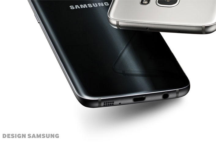
Right where it should be, but hidden flush in the contours as though hidden. The side button and rear camera of the new Galaxy S7 and S7 edge are incredibly subtle. What you have is a continuous fluid body that isn’t disrupted by the button or lens jutting out. We’ve also made a water and dust resistant body without scarifying the design by covering USB and ear jack with rubber. Without re-engineering the wheel, we’ve refined the status quo toward a perfect form. For the Galaxy S7 and S7 edge we chose usability and comfort instead to enable the camera and buttons to be unobtrusive. Now, all that needs to stand out is you.
Color and Material – Everything’s a Bit Deeper

A natural illumination and depth devoid of artificial treatment — four colors were developed to embody this quality: Black Onyx, Gold Platinum, White Pearl, and Silver Titanium. These hues glitter and shimmer as if illuminated from inside the glass surface. Such effects are achieved with an optical layer process that applies film on the surface of the curved glass.
Black Onyx, one of the newly developed colors, applies a unique pattern that fractures light into a unique ebony hue found only on the S7; it enriches the depth of the transparent glass material. Gold Platinum, is reminiscent of smokey quartz; Silver Titanium mixes white and silver for a stern yet vivid feel. Whichever you choose, each color affects the glass material in a distinct and unique way.
Even Easy to Miss Details Weren’t Missed

The first impression packaging and accessories of the Galaxy S7 and S7 edge were not far from the designer’s desk. The sturdy embossed black box hints at the new experience of touch that awaits you, and as it opens up like a book the revealing of the device is a new experience in itself; intuitive, yet undoubtedly premium in the classic sense without even having touched the phone yet.
The Galaxy S7 and S7 edge accessories follow a consistent design approach. In this way, you can literally see the underlying concept as well as the effort put in by each designer to develop each accessory and item to a stringent level of quality. Having said that, each of the 10 items (8 for the case, 2 for power) retain a unique look that was developed through collaboration and cooperation between the developers and designers.
Establishing Sincerity: A Life-Centered UX

A smartphone isn’t just another cool statement piece. It’s probably the most important personal hands-on hands-on device we use in our daily lives. It is therefore vital that you communicate and interact well with it. Likewise, the newly developed interface and UX design of the Galaxy S7 edge adjusts accordingly to your needs and usage patterns. It strives to create not the most efficient and quickest functions or commands but a rapport with you, an experience that is focused on you, where effectiveness and efficiency come naturally.
Connecting You Easier, Quicker

Your smartphone is also an interactive hub that connects all the diverse digital devices in your everyday life. With the Quick Connect function on the new Galaxy S7 and S7 edge, your phone links you with various devices around you. On/Off assists your phone in connecting with Samsung appliances as well as other Bluetooth connections, you can even check battery levels on certain devices. Also, a backlog of linked devices is kept so you don’t have to look for them again at a later time.
The Start of Smart Just Got Smarter

The home and lock screen is probably the focal point of any interaction with a smart device. The clock and weather display has been further refined on the home screen as well as a search function in each app tray for quick searches and access. A new added function is the temporary app tray that holds apps that you’re scrolling through on the home screen in one easy to access folder. The two shortcut icons on the lock screen are customizable to fit your everyday needs, or if you’re a minimalist at heart you can discard the icons all together for a crisp clear lock screen look.
Data Transfer Done Smart

With the Smart Switch function you can now transfer your data from a previous phone to your new Galaxy S7 and S7 edge. USB connection and Wi-Fi Direct are the two connecting options, what’s new about this function is that folders, widgets, home screen layouts, third party apps everything is transferred exactly as they were into your new phone. Maybe not the most exciting of functions newly introduced in the S7 series but the Smart Switch function is one more facet that shows the level of sincerity and personalization you can achieve with the Galaxy S7 and S7 edge.
Off, but Not Really

Even when the Galaxy S7 and S7 edge are turned off, it is still attentive to your movements. AOD (Always On Display), a function specific to the off state of the phone displays the time, calendar or message alerts when you need them without having to turning on the device as we do a thousand times a day.
Wider Edge, Better Usability

The edge panel just got wider. From 260 pixels to 550, the almost double increase in screen real estate opens up multitudes of opportunity that go beyond mere size. Image and text elements are two main benefactors of this increase, while the edge has been opened from just people and apps to third party applications and their functions. The position, size and transparency of the Edge Handler can also be adjusted according to preference.
The previous design of the edge screen was innovative enough for us to take that same technology but refine it and tailor it to fit more into the everyday habits and gestures of you, the user. We’re also confident that with the introduction of third party developers into this arena the floodgates of possibilities have been opened.
Won’t Let You Miss a Beat

The Cross App lets you access different functions even with an application already open on the screen. For example, messages, emails, memos can be accessed with a viewer window that pops up in front of the app in use. Also images, videos, music files, memos, schedule and contact info can be attached with the Attach Sheet interface while all that is going on. Video files can be accessed simply by tapping on the icon in the message app without leaving the screen, while the camera and photos can be taken or sent without even accessing the apps themselves.
Perfected Outside In

The design of a new product shouldn’t be redundant. If anything, the best products are perfected from a holistic approach; outside as well as in, whole and details, even the rapport that users share with their device is of importance. Without too much banter users intuitively understand the device as the sense of sincere premium sets in. Attachment to a product or device stem from this very source as well as we strive to aim higher in our aim to perfection, and we here at Samsung Electronics feel that is where the key to a satisfactory premium product lies.
The Galaxy S7 and S7 edge design has just begun and will continue to be perfected by you. When you interact with it, touch it and use it everyday the simplicity and beauty of meaningful design will touch your heart.


