Galaxy S5 Explained: UX and Back Panel
on May 5, 2014
According to one of the Senior Designers at Samsung Electronics who contributed in designing the Galaxy S5, the overall design concept of the Galaxy S5 was so-called “Modern Flash.” The ‘modern flash’ is a sophisticated and youthful urban style with emotion. Intrigued by this design concept of the Galaxy S5, with the help from the insiders, we dove inside the design of the UX visuals and the back cover of Galaxy S5.
UX – Key Visual

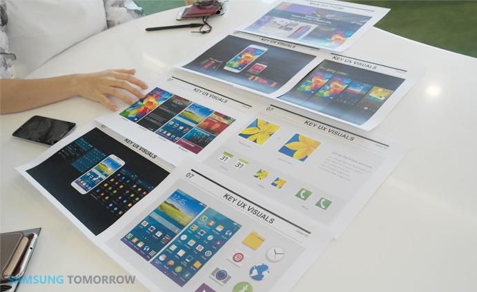
The key UX visual on the main lock screen of the Galaxy S5 has colorful diamond-like shapes that fill up the screen. Considering that the key UX visuals for previous Galaxy devices were image of nature, Galaxy S5 was the first flagship which the colorful abstractive geometrical pattern was used for the Key UX visual..
In terms of color, the design team wanted to make the Galaxy S5 stand out among its competitors. They had to choose colors that could only be presented well in the FHD Super AMOLED display. After numerous tests, they finally selected several colors, including different shades of blue.
If you look at the abstractive pattern, you cannot help to think that it resembles something… Diamond. That is because the designers were actually inspired by diamonds. The ‘brilliant’ or diamond cut design is a design in which diamonds are cut in a distinct form with many facets, having exceptional brilliance. That’s why you can see diamond cuts on the main lock screen, which adds a sense of sophistication to the Galaxy S5 to make it fashionable and unique.
Talking about being unique, the team also included a unique touch feature that pumped bubbles in the extracted color the user pressed on the main lock screen. For instance, if a user presses orange, then orange bubbles appear on the key UX visual. These pumped colors harmonize with the remaining colors on the main lock screen. This special effect provides a unique experience of the Galaxy S5 to users..
UX – Icons & Interface
To make the Galaxy S5 more ‘Modern Flash’, the designers also designed the basic icons and UX icons in the settings to have a stylish look by creating them in a simpler fashion. For instance, the 12 short lines in the clock icon have disappeared, leaving just the hour hand, minute hand, and second hand. In case of the Gallery icon, the seeds in the yellow flower have been removed. Also, the play sign (triangle shape) has gone and a music note has been placed inside the blue circle for the music icon. In addition, the icons in the setting have become much clearer and rounder; in fact, all the icons listed in the setting now have round shapes.
![]()
Morever, while in previous Galaxy flagships, the features in the settings were only shown in a list, in the Galaxy S5, they can be seen in three types of views such as a grid, list, and tab (category). Thus, with an easy-to-see icons and interface, you can clearly say that the Galaxy S5 is a trendy smartphone.
In result, many users have been raving about the clean and neat tidy looking icons and UI compared to that of previous Galaxy products.
UX – # of Apps
However, there is another reason the UI of the Galaxy S5 looks so neat and simple.
The Galaxy S5 has 40 applications only, which is much reduced compared to, for example, the Galaxy Note 3 having 51 apps. 40 applications in the 2 pages. That’s it. If wanted, other relatively less frequently used apps can be easily downloaded through Galaxy Essential and Galaxy Gift widget.
To find the most important features from the consumers’ perspectives, Samsung used its collected data of VOCs (Voice of Customers) on the existing and previous devices. From the VOCs, it was found that most of the Galaxy users said some apps were not used as frequently as they anticipated. Therefore, Samsung decided to reduce the pre-installed app to 40.
UI of the Galaxy focusing on the basic yet essential functionalities has been getting many positive reactions from the users.
Back Cover – The Touch
Samsung wanted to make the Galaxy S5 have the softest and most comfortable grip, therefore, Samsung especially concentrated on the feeling of touch, as many apps like the S Health that users need to touch were included. Hence, the design team of the Galaxy S5 focused on the feeling of the handgrip of the Galaxy S5.
According to the design.samsung.com, the small holes on the panel provide a tactile grip to the fingertips when users touch the back of the phone. The S5’s unique cushioning materials deliver a reassuring give when held in the user’s hands. Combined with the perforated exterior and a material soft as sheepskin, the S5 provides a truly optimal grip.
The team wanted to find a certain material that was close to nature and was most natural. To find that right material, they touched hundreds of fabrics in different colors, sizes, and types such as plastic, wood, textiles, glass, and adhesives. Among the samples, they believed that sheepskin leather had the softest touch and a comfortable grip. That material not only was natural but also was sophisticated for its usability in handbags or purses from famous designer brands. Thus, the sophisticated sheepskin leather like feeling was chosen for the back of the Galaxy S5.
.
Back Cover – The Glam Look
Talking about the color, the back cover of Samsung’s previous Galaxy series were always “high glossy” or shiny. However, the back cover of the Galaxy S5 is not shiny but shimmery instead, aka the glam look. In fact, to make Galaxy S5 attractive especially to younger users, the designers researched day and night to find the right colors. After extensive research, they found out that the luster of the color that appeared softly was appealing to consumers in their twenties and thirties.
Hence, the designers used metallic colors that softly brought out the glossiness of the colors. Also, they used a matte finish so that the gloss was slightly hidden. This led to producing a pearly and milky color, shimmery White, also creating the charcoal Black, electric Blue and copper Gold. Thus, the white models have a white face, the gold phones are accentuated by a golden frame, and the black devices add depth to their dark exteriors by adding hints of dark grey.

Now you have some idea of why Galaxy S5 looks and feels the way people have been talking about. From the overall design concept to the design of the UX visuals and Back cover, Samsung Tomorrow went inside the design of the Galaxy S5. We have a lot more exclusive information on the Galaxy S5 to come, so feel free to come visit the blog for more.