Galaxy S6 Has a Simpler Interface That Also Looks Better
on April 8, 2015
The Samsung Galaxy S6 has received rave reviews for its new innovative design since it was unveiled at the Mobile World Congress in March. While the phone’s new look and feel is the most obvious design change, Samsung also put a huge emphasis on transforming the user experience (UX) and the user interface (UI) of its new flagship. This smartphone not only looks great, it is also dramatically simpler to use.
One change that’s immediately obvious is the application screen, which has been changed from black to white for better readability. Most importantly, though, the Samsung UX designers sharply reduced the number of menu options at every level and replaced ambiguous pictograms with clear and simple text. It does not take away from the phone’s functionality, but makes for a much faster and more intuitive user experience. Compared to previous devices, the number of steps to complete regular smartphone tasks has been reduced remarkably.
Reduce and remove for a simplified UX
Take the Contacts app on the Galaxy S6, and compare it to that of the Galaxy Note 4. Rarely used function tabs like Recent Contacts and Favorites have disappeared. Instead, there is a simple set of menu options, including Contacts, Groups and More. Clicking on More makes the new UX design philosophy even more obvious. The Galaxy S6 has narrowed this menu to just four options, Edit, Share, Manage Contacts and Settings – which is notably fewer than the Galaxy Note 4, which presented users with six options to choose from. This is the result of Samsung’s thorough survey on how people use their smartphones.
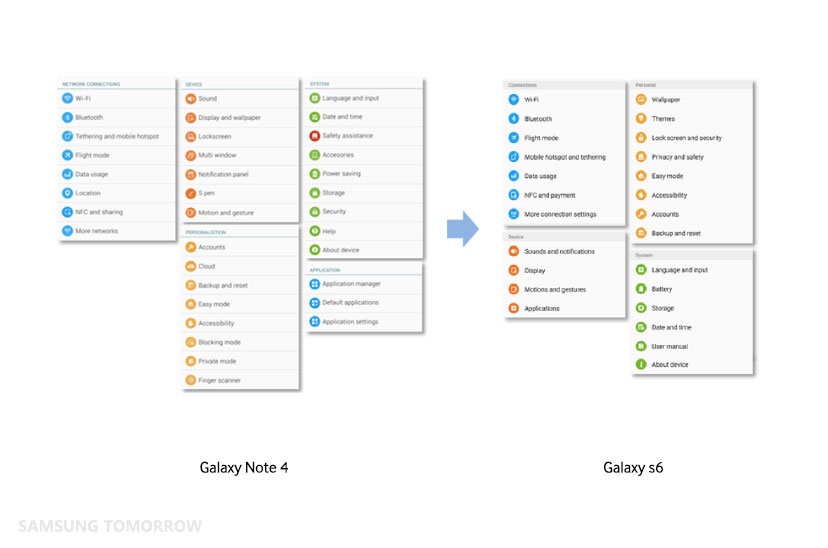
The Settings menu has also been slimmed down, with a similar offering of functions and structures that make it easy to get things done. In total, the Galaxy S6 offers 24 menu options arranged in four categories, including Connections, Personal, Device and System. It’s a significantly smarter and more efficient menu than the Note 4, which had a total of 34 menu options. The bottom line is Galaxy S6 provides already-optimized menu options, rather that cluttering the menus with too many options.
Samsung’s developers also improved the UX for the Galaxy S6 by reducing the number of pop-up alerts and notifications, such as Confirmation and Help.
The Graphic User Interface (GUI) is another area that has largely become simplified. Users want to focus on the information they regularly use. These kind of improvements can be found across the UX
By introducing text icons instead of pictograms, Samsung has simplified the way users access apps, which makes life a little easier for people who are not familiar with the system.

Samsung’s developers also purged the tech jargon and replaced it with normal language that users can understand. For example, the term Network SSID was replaced with Network Name, and Font Style with Font.
Another highlight of the improved UX is Visual interaction. For example, when you touch the screen to unlock the phone, a flow of water appears on the screen in response to your touch. When you slightly tilt the phone, the water flows in the same direction.
What’s more, when you swipe to the left or right of the Galaxy S6 edge home screen, the widgets and icons move seamlessly, as if they were smoothly gliding from one edge of the screen to the other.
Also, when you lock the screen, it doesn’t black out all at once. The center of the screen darkens and quickly spreads left and right, like a curtain effect, until the full screen is closed out and locked.

The home screen glides toward the edge of the phone (Left) A flow of water appears when unlocking the screen (Right)
New UX, Unique and Powerful
The Galaxy S6 edge is the world’s first smartphone with a dual curved display. But the edges were not just made for aesthetic purposes. They also have a significant impact on how people use the device. The edges can display important information, including weather, stocks and news, when the phone is lying face down. This information is visible on the edges of the device and can be activated with a simple touch.
Samsung calls this display the People Edge, and it’s obvious why. With People Edge, different colors – blue, green, yellow, orange and purple – can be assigned to different people (one for each color). When one of them texts or calls, the phone will glow the assigned color. So whether you are in the middle of an important meeting or playing sports, the color will tell you instantly whether someone near and dear is trying to get in touch.

Edge Lighting

People Edge UX
The Galaxy S6 is the first Galaxy S with Themes, which allow users to change the look and feel of the phone. Applying a theme will change the look of the lock screen, home screen and icons, as well as 14 applications such as Phone, Message, Clock and Calculator and the Notification Bar.

Samsung revealed a set of Avengers themes, a collaboration with Marvel, at MWC in March. More collaborations with other partners are also in the works. Samsung is developing a theme-maker tool that will be distributed to partners and individual theme designers.
Samsung has gone to great lengths to improve the UI and UX. It’s just one more thing that people are going to really love about the Galaxy S6 once they get their hands on it.

