[Interview] Balancing Form, Function and Feel: Samsung Designers Discuss the Galaxy S8 Design Process
on April 28, 2017
The Galaxy S8 and S8+ redefine the smartphone and the role it plays in our lives with its neutral, harmonious design that balances form, function and feel.

Hyoungshin Park, Hyoksu Choi, Yunjin Kim (top row), Hyejin Bang, and Hwanju Jeon (bottom row) of the Design Team at Samsung Electronics’ Mobile Communications Business discuss how the design of the Galaxy S8 was brought to life.
Q. Is there an overarching design philosophy that defines Samsung’s smartphones?
Hyoungshin Park: The very foundation of Samsung’s smartphone design is built on neutrality. Through the pursuit of neutrality, we are able to create designs that blend naturally into the environment, seamlessly integrating with the lives of all users, regardless of their age, gender or geographic location.

Q. How has neutrality influenced the design of the Galaxy S8 specifically?
Hyoungshin Park: It’s often said that the whole is greater than the sum of its parts, and this certainly rings true for smartphones. So, in line with our philosophy of neutrality, we aimed to create a seamless design that highlights the visual unity of the device under the concept of ‘oneness.’
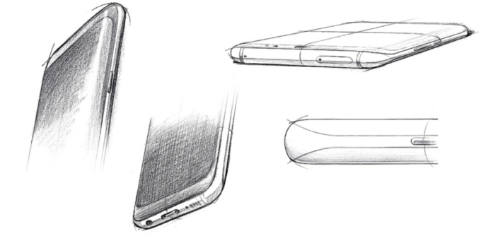
To do so, we focused on creating a design that is harmonious, natural and centered on the true essence of the Galaxy S8. First, the display was softened with rounded corners to harmonize with the device’s subdued aesthetic. Next, we refined the curves on the phone’s frames to make it feel more natural in the hand. Finally, the sensors and keys on the front of the smartphone were refined to highlight its display, the true essence of the device.
Q. The Galaxy S8 incorporates glass and, two materials that Samsung has used in past smartphone designs. How does the concept of oneness apply to these materials?
Hyejin Bang: Samsung’s CMF (Colors, Materials, Finish) designers have always sought out materials that add the most value to the device. Glass and metal provide a perfect balance between aesthetically pleasing design and smartphone hardness and shock-resistance.
The Galaxy S8 in particular is differentiated by the oneness of its materials. The colors of the materials have been tuned to create a seamless transition from metal to glass. To harmonize the design, various finishes were applied – the light-reflecting nano-patterns on the glass and a high gloss finish on the side metal frame. This ‘Liquid Shade’ concept naturally embraces the structure, unifying its shape through color.

Q. Unlike previous devices, which boasted a uniform color on the front bezel and backside, all versions of the Galaxy S8 feature a black front bezel, despite the color of their rear body. What’s the reason for this?
Hyoksu Choi: Although the smartphone evolved from the telephone, it has developed into a display device, more than anything else.
Recognizing this as the smartphone’s true essence, we felt that we needed to enhance the immersiveness of the display. By applying black bezels and tint prints on the front of the smartphone to hide the front sensors, camera and other technical components, the display appears to seamlessly stretch from the top to the bottom of the device when not in use.
Q. What inspired these colors?
Hwanju Jeon: We selected the Galaxy S8 colors based on color trends in the fashion, interior design and automotive industries, among others, through cooperation with overseas design labs. We specifically looked at colors that express vibrancy and liveliness – hues that speak to young Millennials. The new color, Orchid Gray, for example, combines a trendy purple hue and a subtle gray to evoke a sense of uniqueness.

Q. There were also some changes to the smartphone’s buttons and keys. What are the reasons behind the changes?
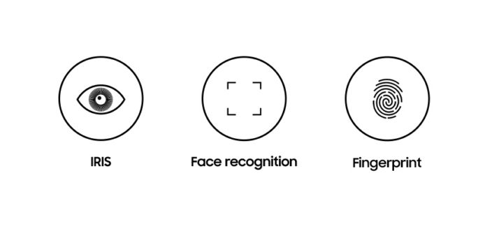
Yujin Kim: In order to maintain the essence of the smartphone as a display device, we placed the Home button behind the display, which provides the same haptic feedback as a hard key when pushed. We also moved the fingerprint scanner to the back of the device – a location users can easily reach when holding the device in their hand. Through these changes, we were able to create more screen space without sacrificing convenience.
Furthermore, we adopted a designated button for Bixby and placed it just below the side key to allow for instant access and intuitive usability, without compromising the design of the device. It was a long journey to find the right balance between technological evolution and consistent user experience.
Q. Considering so many different people worked on various aspects of the design, how were you able to apply the concept of ‘oneness’ to create a coherent design?
Hyoungshin Park: Designing the Galaxy S8 was a lengthy, systematic process – one that lasted much longer than a year! – and required a great deal of teamwork. From the get-go, we looked at social, cultural, technological and design trends in different regions throughout the world, and identified those that overlapped. After all, good product design isn’t simply inspired by art, but rather by the people that use it.
From there, we compiled keywords and images to create a sort of map and distributed it to designers, who then established a set of common design goals. This process allowed strategy, product design and CMF design teams to have a clear understanding of the direction of the design. As a result, the form, colors, materials and concepts of the device are aesthetically and functionally coherent.

Q. While good design is no doubt an essential component of a smartphone, so is technological innovation. How did the design and development teams work together to harmoniously merge form with function on the Galaxy S8?
Hyoungshin Park: Of course, our team worked together closely, but constant cooperation with other teams was necessary to ensure a quality final product. Perhaps the matter that demanded the most cooperation was applying rounded corners to the Infinity Display.
First, we had to find a way to ensure that the design would not interfere with the UX. So, the UX design team performed various user simulations to determine the number of pixels needed to create a rounded corner. Next, the product and design teams developed a round design to fit the curvature of the edge glass and outline of the product under the conditions determined by the UX team. The hardware team then introduced a format that would cut off the display to fit the design, while we worked with software team to create a more refined representation of the screen on the rounded corner.
Of course, designers and engineers speak very different languages so we often gathered together to translate words to numbers and vice versa so we could all be on the same page. In the end, however, we were able to collectively, as one, achieve our goals.

Q. As a smartphone user – and not just a designer – are there any features that you, personally, were happy to see added to the Galaxy S8?
Yujin Kim: Our smartphones are constantly in our hands, so, for me, a comfortable grip is really important. Although the grip of the Galaxy S7 was well received, we wanted to make it even better with the Galaxy S8, and made more than 100 prototypes to get it right. Through slight changes in the form and the addition of small details, we were able to create a device that fits comfortably and naturally in the hand.
Q. Which part of your job do you enjoy the most?
Yunjin Kim: Designing a smartphone can be very demanding. Timelines are tight and there’s certainly no room for carelessness. Nevertheless, we are essentially designing a product that people use over and over, every day. It’s always fascinating to imagine how people might use our product, or what they would look like doing so. There’s no greater reward than seeing someone benefiting from a device that I helped design.


