[Interview] One UI Design: Creating the Best Galaxy Experience
on February 26, 2021
There isn’t much you can’t do with a smartphone these days, from filming content to banking online from anywhere with just a few taps. But there is always room for improvement, and Samsung Electronics is constantly seeking to make the smartphone experience more intuitive to help us do even more. This is why One UI was created.
Unveiled in November 2018, One UI improved smartphone usability for millions of users. After two years of further evolution, Samsung launched One UI 3 in December 2020, building on the design, efficiency, and user experience of the original across various devices. Now Samsung is raising the bar yet again with One UI 3.1. From February 18th, the latest One UI is bringing updates to support powerful functionality for some existing smartphones.1
So what kind of experience can users enjoy with One UI 3? Samsung Newsroom sat down with the designers of One UI to ask them what we can expect.
The 4 Principles of One UI
1) Focus on the task at hand
2) Interact naturally
3) Be comfortable to view
4) Make things responsive
These four principles were established by One UI designers to give users the best experience possible.

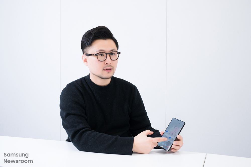
Jeonggun Choi, Principal UX Designer in the Core UX Group, Mobile Communications Business, Samsung Electronics
The fourth principle is a completely new principle introduced for One UI 3.1.
“From tablets to foldable phones and regular smartphones, the types of devices people are using have diversified, and the number of features and functions has also increased,” said Principal UX Designer Jeonggun Choi. “Following this trend, new principles were needed to provide the best layout for our users.” Whether an app is running on the Galaxy S21, Galaxy Tab, or the foldable Galaxy Z series, the UI is optimized for each device.

When using the Samsung Notes app on smartphones with regular sized displays, for example, users can access the app menu by pressing the navigation button at the top left side of the screen. But on the Galaxy Z Fold and Tab series, users can take advantage of the larger display by having the entire menu always in view, without having to press anything.

As part of the fourth principle, Samsung has also improved the accessibility experience by recommending features that complement the ones already in use. When someone with impaired or weakened vision has High contrast fonts turned on, for example, One UI suggests other features that improve visibility such as Bold font or Dark mode on the Recommended for you screen. One UI also reduces the hassle of having to sort through several menus by allowing users to turn off any accessibility features they are using from a single screen.
“Accessibility features are so diverse that it can often be difficult to use them to their full potential,” said Jeonggun Choi. “The ‘Recommended for you’ function increases convenience and helps users get more out of those features by identifying and recommending ones that users may need. We’ve also made it easy to use these features only when needed by allowing users to turn the features on and off while in use on one page.”
Galaxy Ecosystem Allows for Seamless Connectivity Between Devices
Another perk offered by One UI 3 is the ability to seamlessly switch between smartphones, tablets, and laptops. Taking into account the increased use of tablets and laptops spurred by a boom in remote learning and work, the new update provides a ‘connected device experience.’ This seamless ecosystem is paramount to enhancing study and work productivity.

“A new feature called ‘Continue apps on other devices’2 has been added so that users can continue whatever they were doing on their smartphone – whether browsing a web page or working on a draft in Samsung Notes – on their tablet,” said Principal UX Designer Min-Young Chang. “Users can also copy text on their smartphone and paste it onto their tablet.”
In addition, users can connect their Book Cover Keyboard to both their tablet and smartphone with the Wireless keyboard sharing feature. The new Auto Switch feature also automatically connects Galaxy Buds to whichever device is playing media, so that users can seamlessly switch between their smartphones and tablets.

Connected device experiences are not only available with mobile devices, they are also available on home appliances such as TVs. Starting with One UI 3, users can use Smart View to enjoy multimedia content from their smartphone on their TV alongside the camera feed from their smartphone. This is especially beneficial for users who work out at home, allowing them to compare their movements with those of their virtual instructor.
“Starting with the One UI 3.1 update, users can cast their Google Duo video calls onto their TV with a few clicks,” said Jeonggun Choi. “With an increasing number of people connecting with their family via video calls and conducting virtual work meetings, this is an especially useful feature.”
A Customizable Galaxy Experience to Suit Your Needs

Smartphones are no longer just a tool that gives users the power to do various tasks—they’ve become a means of self-expression. Perhaps the best example is decorating the Galaxy Z Flip with stickers to create your own unique phone. But there are many ways to create a custom smartphone experience with the latest updates. “We have implemented a diverse array of features to let users use their smartphone as a form of self-expression,” said Jeonggun Choi. “Users can enjoy a customized Galaxy experience by choosing a video as the incoming and outgoing call screen or changing the wallpaper in the Messages app.”

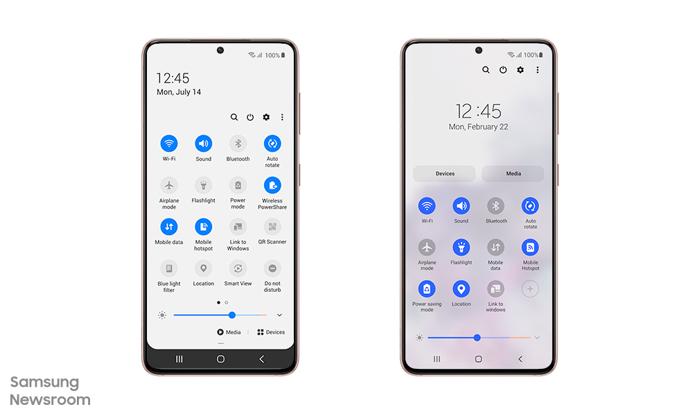
Before (left) and after (right) views of the quick panel. The design has been simplified and the most commonly used icons have been placed to speed up the search process. Users can add other icons by clicking the ‘See more’ button in the top right corner.
“We first analyzed the usage for each feature available in previous models,” said Min-Young Chang. “After ranking the features based on their popularity, we placed the most used features at the top while hiding the least used features to simplify the panel.”
Saving Your Time, Even if it’s Only 1 Second

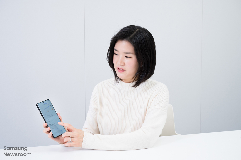
Min-Young Chang, Principal UX Designer in the UX Design 2 Group, Mobile Communications Business, Samsung Electronics
Another updated feature available through One UI 3.1 is the integration of the Clock app with Digital Wellbeing’s Bedtime mode.3 After opening the Clock app, users can tap See More, then tap Set bedtime to set their sleep and wake-up times. Users no longer have to switch between two apps, making setting a daily sleep schedule easier and faster.

“Users might not be aware of all of the One UI design updates that have been made but these improvements combined help users recognize and react to various features quicker and in a more direct manner. Even if it saves 1 to 2 seconds of user’s time, I think it would have been worth the effort,” said Jeonggun Choi. “The One UI designers are going to continue coming up with designs that elevate our users’ happiness and satisfaction with Galaxy devices.”
1 Features of One UI 3.1 may vary by device model. Updates may vary by carrier, country, and model.
2 Both connected devices need to be running One UI 3.1 or above, have Bluetooth turned on, be signed into the same Samsung account and be connected to the same Wi-Fi network.
3 The feature allows users to change the background to grayscale and mute incoming notifications in order to help them sleep better.
