[In-Depth Look] The Galaxy S8 Design and UX
In a world where socio-cultural borders are blurring more and more with each passing day, the Galaxy S8 and S8+ redefine the smartphone and the role it plays in our lives with a neutral design and UX that transcends geographic, age and gender boundaries. Unconfined by bezels or buttons, and united by a single, continuous visual and sound experience, the Galaxy S8 was designed to blend seamlessly into one’s life, enabling a more natural interaction between the user and the device.

Harmonizing Art and Technology
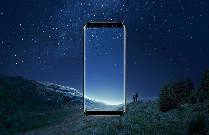
The Galaxy S8 builds on Samsung’s heritage of creating stunning designs with a large Infinity Display – an end-to-end, bezel-less screen that spills over the phone’s sides. Available in 5.8-inch and 6.2-inch models, the seemingly endless Infinity Display defies the borders of conventional framework.
Inspired by nature, the Galaxy S8’s gentle surface screen forms a continuous silhouette with no protrusions or sharp angles, while the phone’s subtle curvature smoothly flows from the front to back with symmetrical balance. The harmonious aesthetic of the display reflects the overall design of the device, complementing its comfortable grip and usability while creating a more organic connection between the device and the user.

Visually obtrusive elements have been minimized to create more tangible screen space, thus enabling enhanced usability and a more immersive viewing experience. A home key embedded underneath the screen functions and responds to pressure just like a physical button would, while the recent and back buttons are now soft keys that can be customized in different colors.

Available in five colors including Midnight Black, the all-new Orchid Gray, Coral Blue, Arctic Silver, and Maple Gold, the Galaxy S8 is enhanced by a rich color palette that envelops the device, intensifying the depth and unity of the design. The phone’s metal frames balance nicely with the natural luster and depth of its glass body, creating a seamless color transition that brings together art and technology to complete the phone’s concept of oneness.
One Continuous User Experience
Designed around the Infinity Display, the UX of the Galaxy S8 was developed with a focus on rhythm to enhance the flow of user interactions and better fit the way people use their phones today. Like the design of the display itself, the UX is seamless, unifying both visual and audio components to establish one continuous experience.

The default wallpaper of the customizable Always-On Display complements the color of the phone, while its aesthetic transitions smoothly to the lock and home screens. Meanwhile, a new vertical swiping interface facilitates navigation between the home screen and app tray – a swipe up or down gives users quick and seamless access to their apps. Or, should they choose to do so, they also have the option of adding an apps screen button to the home screen.
The new UX also adds convenience by making it possible to simultaneously move multiple apps into a folder. Additionally, users can tap and hold an app icon to open a quick options menu that lets them perform tasks such as uninstalling apps or moving them to Secure Folder without having to open the app.

Even the app icons and typography of the Galaxy S8 incorporate the phone’s new design language through a play of continuous curves and lines to create depth.
The Galaxy S8’s ringtones have also been updated to better harmonize with the design of the device, while a new version of Samsung’s brand sound, “Over the Horizon,” has also been released. Arranged and recorded by Grammy Award-winner Jacob Collier, the 2017 version of “Over the Horizon” combines elements of contemporary jazz, pop and dance genres to create a tune that is at once youthful and innovative.
Products > Mobile
For any issues related to customer service, please go to samsung.com/in/support for assistance.
For media inquiries, please contact corpcommindia@samsung.com.
