[Interview] Beyond the Surface: Discover Samsung’s Design Philosophy Through Galaxy Visual Identity System
28-08-2023
Galaxy has carved out a distinct identity by continuously introducing a series of groundbreaking product designs and form factors. The “Galaxy Visual Identity System” video highlights the design identity of the Galaxy brand in an engaging way.
Samsung Newsroom sat down with Henry Hongmin Kim, Vice President and Head of Design Strategy Group, Mobile eXperience (MX) Business at Samsung Electronics, and his team of designers to understand the inspiration behind the Galaxy Visual Identity System. Keep reading to learn how the team is redefining Galaxy’s iconic design.


Q.Please introduce the Galaxy Visual Identity System.
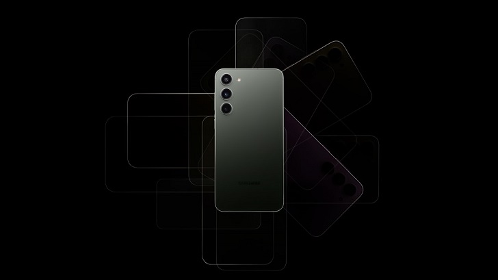
The Galaxy Visual Identity System unifies various product designs and form factors into one cohesive identity. We deeply contemplated how to express the message of Galaxy clearly and with emotion. After much thought, our team decided to establish an integrated Galaxy brand image by expressing each model in a simple, symbolic manner.
Q. What’s the message behind the Galaxy Visual Identity System?
The philosophy of Galaxy Design is “Essential Design.” This idea is applied to all areas that require visual communication, not just the design of Galaxy products — such as form factor, color and material.
By establishing the Galaxy Visual Identity System, we intended to showcase the unique, differentiated characteristics of Galaxy through various form factors and express Galaxy’s sincerity and minimal yet impactful design. Through such efforts, we expect to further strengthen the design identity of Galaxy.

Q. What challenges did you encounter while creating the Galaxy Visual Identity System?
Until now, the graphic design for Galaxy packaging was created based on typography that represents each series — whether its Galaxy S, Galaxy Z, etc. For the latest devices, we challenged ourselves to visually communicate Galaxy’s competitive edge.
To create the most comprehensive visual identity, we studied each product from different angles to explore what design best represents each form factor.
Q. How was the Galaxy Visual Identity System incorporated into the new Galaxy product designs?
We incorporated the Galaxy Visual Identity System for the first time in the Galaxy S23 package design. Following that, the system was applied to the packaging for the Galaxy Z Flip5 and Z Fold5, allowing us to introduce the completed visual design to consumers.
The Galaxy Visual Identity System signifies symbolism, scalability and dynamism. Each product is designed to connect its representative characteristics together while considering scalability to include different colors and experiences. These factors offer a dynamic quality adaptable to any situation within the unified system. We aimed to enhance Galaxy’s image by demonstrating the innovation of upcoming Galaxy products in a playful and enjoyable way using this brand identity.
Q. What message is the video trying to convey?
Design communication is one of the key roles of the Design Strategy Group. Through dynamic motion graphics, we made sure to include every aspect of the Galaxy Visual Identity in this film — from the design process to symbolism based on each form factor and versatile scalability.


For instance, the line illustration at the beginning of the video shows how our products take shape. Then, we use a three-dimensional embossing effect to illustrate the texture of craft paper and communicate the significance of Galaxy’s recyclable package design and our consideration for the environment. Using various materials, such as glass and metal, we tried to represent the CMF (Color, Material, Finish) of each product line.
In addition, the video goes beyond the technical aspects of the form factors and portrays values based on the customer experience (CX). The scene where the devices transform into windows represents openness, the philosophy of the Galaxy ecosystem, while the Braille graphic symbolizes accessibility and inclusion. The outer space visual further expresses Galaxy’s brand identity. What’s more, elements from smartphones that consumers are familiar with are illustrated — such as sticky notes, digital watch faces, musical instruments and games.
Q. What details would you like consumers to notice in this film?
Ideas and symbols are cleverly included in every scene, similar to hidden Easter eggs. Viewers can search for these details and enjoy the meanings they bring.


For instance, the silhouette of the Galaxy Ultra’s S Pen is tucked away in the window scene. In the following digital watch face shot, the initials for Galaxy S, Flip, Ultra and Fold are placed on top of the numbers, disguised as each respective device. There’s also a detail that symbolizes the S Pen, adding another layer of fun. Then, the score is 2023 on level 23 in the following graphic depicting a popular game. All the blocks on the board represent the four Galaxy models. By making the completed blocks disappear, we wanted to build anticipation among viewers for the new products slated to launch next year.

“Design is thinking made visual.” In this process, it’s important to strip away any unnecessary elements and communicate the main idea concisely. This is what makes Essential Design truly effective. Our goal is to create simple yet purposeful and meaningful designs for the future.
For any issues related to customer service, please go to samsung.com/in/support for assistance.
For media inquiries, please contact corpcommindia@samsung.com.