|

Click for Korean☞ KOREAN
Designing the Galaxy S II! Simple and Smart
An interview with a designer of the Galaxy S II has been released through SMNR, SAMSUNG ELECTRONICS.
* Interview above was reported through SAMSUNG internal communication magazine LiVE.
“It’s simpler and cleaner.” “It’s slimmer.” “It’s smarter.” These were just some of the responses we heard when we unveiled the Galaxy SII at the Mobile World Congress 2011 in Barcelona on the 14th.

For the Galaxy S II, we shaved off 1.4mm from the 9.9mm Galaxy S, meaning that the new unit comes in at just 8.49mm. That slim design alone was enough to grab people’s attention. We’ve heard from the product planners about what’s inside and how they developed this great new smart media device. Now, let’s hear some of the behind the scenes story from the product designer, Bang Yong-seok.
 Q. Please introduce yourself. Q. Please introduce yourself.
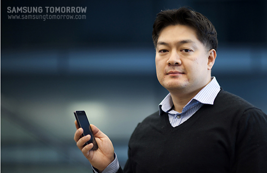
A. I’m Bang Yong-seok of Product Design Team 1. I do my work with a “do first” philosophy and I usually design original forms.
Q. Given that Galaxy S was such a success, there must have been lot of pressure for you in designing the SII.
A. The Galaxy S has sold more than 2 million units in Korea and more than 10 million overseas. Instead of pressure, I felt a lot of pride. Of course, there is pressure, especially with so many smart phones coming on the market these days. But everyone on the inside strongly felt that we could continue the success of the Galaxy S, even with the flood of new competing models. That helped me focus on creating a product that delivered on the promise of Galaxy S, and then some.
Q. From a design aspect, what is the concept of the Galaxy SII? Could you tell us some features?
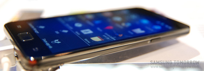
A.The most noticeable aspect is that it’s thinner and lighter than the Galaxy S. The battery cover has changed as well. One of the big concepts of the Galaxy SII was that it had to be the “NEXT Galaxy S” which meant that all aspects had to be an improvement from the Galaxy S. From a designer’s standpoint, making it slimmer was the biggest mission. But it wasn’t just about the thickness. We also had to make the display larger and make it fill up the front view of the phone with a narrower bezel. I was inspired by the reflection of light, and used the shadows cast when light is shone onto an object as hints. We really wanted to slim the design in a sensual way.
Artists call it ‘chiaroscuro’. If there is no light, all object forms or colors in this world would be meaningless, and that is why I think choosing light as a metaphoric concept for the design was a good choice.
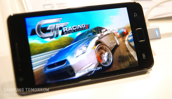
The next concept was “Design a smart phone that is truly smart.” This really got us thinking about how to make the design look smarter. If the Galaxy S was a friendly design, we wanted a smarter, more clean-cut feel. We used curves to generate a look of intelligence, rather than giving it a rounded off look. Management will probably say that we spent too much on our mockup and, in fact, we actually made hundreds of mockups. But that was because we were fully devoted to what we were doing and approached the design from various angles.
Even when creating round curves, we didn’t miss out on even .1 mm of the design. We approached the design scientifically to perfect the grip, the roundness, and the stress on our hand when we hold the device. It’s not just the look that we were thinking about. I can confidently say the design is optimized from a usability standpoint, as well.
Of course consumers will have mixed responses, but I’m sure those who value usability will all appreciate the new design of the Galaxy S II.
Q. As this is the “NEXT Galaxy S” I’m sure that you listened closely to the voice of Galaxy S customers. What was the most dominant opinion?
A. We heard many things from users, starting from the product design, user experience, usability, etc. The challenge was to listen to the customers’ voices while also coming up with our own innovations that would change the product. As I’ve mentioned before, the two concepts were “Let’s make a smarter product,” and “Let’s make it ultra slim.” But we also had to keep in mind that slimmer is not always better, and we had to consider the grip and the usability at the same time.
Q. When did you start working on the project?
A. We started in April last year. But the final design was confirmed just two weeks ago. We were trying to decide what color to put onto the product. If you look at the process, it is very much like bearing a child. Of course, the 10 month period is also similar, but when the first draft came out, when the design was completed, when the first mold came out, looking at the products circulating on the belt, and when the final product came out… all these steps seemed very similar to when a woman gives birth. From designing to producing a complete product, it was much like the child growing inside the body of the mother, and finally emerging into the world.
Q. The change in material and pattern catches the eye.
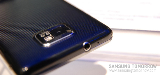
A. We focused on creating a unique exterior look while cutting costs. In fact, we wanted a metallic material. But taking antenna reception into consideration, we decided to use a material called “hyper-skin.” The design aspect of the hyper-skin is that it has more ‘bling’. Functionality-wise, the material does not attract fingerprints or oil marks. For us, as designers of this kind of product, that’s catching two birds with one stone.

As for the pattern, we received a lot of help from the CMF(Color, Material and Finishing) team. The pattern is the tangled one that you see in fabric. The diamond pattern and pyramid pattern uses the refraction of light to create a dispersed image.
Q. What was the most difficult issue before the design was finalized?
A. The biggest issue before the final design was the camera. The 8MP camera would make it stand out 1mm, and we had to figure out how to handle that. We did the best we could with the design, and of course, we received a lot of help from the mechanical team. I remember struggling to the very last moment to reduce the bezel thickness. Of course, internally, some people wanted to create a clean cut, full view of the screen.
Q. How many colors will the device be released in?
A. The color line up has not been finalized yet. We have to decide on the colors before production begins, and we are planning to use colors made through the use of light. So, even if the color is black, it won’t be 100% black. We will try to blend in chocolate colors to it so that when you move the device the color will seem like its rolling around. We will try to give a dispersed look of the light, much like when the sun starts to rise at the end of the horizon on the ocean. I hope everyone will expect big things for the Galaxy SII’s colors. It will be deep with light gently dispersing over the surface, giving it class and a mysterious touch.
Q. What was the most difficult part of your job?
A. Nothing in particular that I remember. Everything was well coordinated. The Planning and Mechanical R&D teams were really helpful and cooperative. But, deciding on the concept was the difficult part. The initial product concept was “slim and smart design,” and to make that concept happen the designer has to come up with something unique. My main concept was “light.” I tried hard to capture the reflection of the light and apply it to the color of the product. I think that applying the “light” concept into the product was probably the most difficult part.
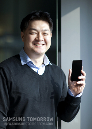 Q. Who would you like thank the most? Q. Who would you like thank the most?
A. Firstly, I would like to thank my team members and the HW team for their support. The mechanical team, and all the design team members working on the CMF and the UX, they all deserve a lot of credit for their hard work. It is much appreciated.
Also, because of my work on the Galaxy SII, I wasn’t able to pay close attention to my family, and I would like to thank my wife and kids. In fact, my wife also works as a designer in the Home ppliances design team. So she knows how busy things can get around here once a project begins. But she still gave me the evil eye when I came home late sometimes. Now, with the product set to be rolled out, I think I can feel a little more confident and a little less sorry to my wife.

☞ [SMNR] All that Galaxy S II – more faster and stronger
☞ [SMNR] Words with Men Who Planned the Galaxy S II
☞ [SMNR] Galaxy Tab 10.1, The Tab Got Bigger
☞ [SMNR] Interview with Galaxy Tab 10.1 Planner
<Samsung Social Media News Release>
News about Samsung Social Media News Release from MWC 2011. The articles are in a variety of languages, so you may want to use a translation service to view blogs in languages other than its original. Keep in mind, though, that Samsung SMNR does not guarantee the accuracy, safety, usability, or suitability of translations from translation services.
Google Translate Yahoo Babel Fish Applied Languages
|
|

